The seven changes that remove the most real barriers on a small business website, ranked by who they unblock rather than by how easy they are.
·4 min read
Accessibility guidance tends to arrive as a list of eighty items with no
indication of which ones matter. That is how it ends up ignored.
These seven are the ones that, in practice, unblock the most people on a typical
small business website. They are ordered by who they stop, not by how quick they
are to do.
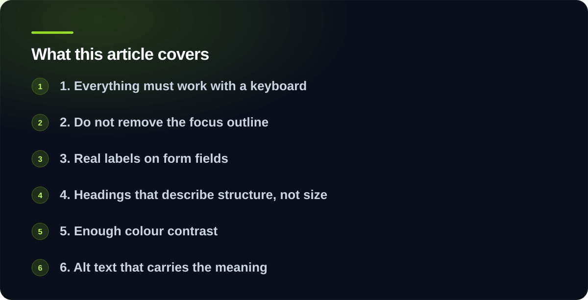
1. Everything must work with a keyboard
If it can be clicked, it must be reachable and operable with Tab and Enter.
This is the highest-impact item on the list because it affects people using
screen readers, switch devices, voice control, and anyone whose hands do not
work well with a mouse.
The common failures: custom dropdowns built from divs, modal dialogs that let
focus escape behind them, carousels that only respond to swipe, and menus that
only open on hover.
Test it yourself in two minutes. Put your mouse away and Tab through your own
site. If you cannot reach the menu, open the form, or close the popup, that is
your first job.
2. Do not remove the focus outline
Somewhere in almost every stylesheet is a rule that removes the focus ring
because a designer thought it looked untidy.
That outline is how a keyboard user knows where they are. Removing it makes the
entire site unusable for them while looking perfectly fine to everyone else,
which is why it survives so long.
Style it if the default is ugly. Never delete it.
3. Real labels on form fields
A placeholder is not a label. It disappears when someone starts typing, is often
too low-contrast, and is not reliably announced by screen readers.
Every input needs a visible, associated label. Error messages need to say what
is wrong in words, be associated with the field, and not rely on colour alone to
indicate which field failed.
Forms are where accessibility failures cost you money directly, because a form
nobody can complete is a customer who went elsewhere.
4. Headings that describe structure, not size
Screen reader users navigate by heading, the way a sighted reader skims. That
only works if the headings are real headings in the right order: one h1, then
h2 for sections, h3 beneath those.
Text made large and bold to look like a heading is invisible to that navigation.
Choosing h3 because h2 was too big is the same mistake in reverse; set the
level by structure and control the size with styling.
5. Enough colour contrast
Text needs to stand out from its background: 4.5:1 for normal text, 3:1 for
large text and meaningful interface elements. Light grey on white fails, and it
is everywhere, usually because it looked elegant on a designer’s calibrated
monitor.
This one is genuinely easy to check with a tool and genuinely affects a lot of
people, including anyone reading outdoors on a phone.
6. Alt text that carries the meaning
Not a description of the picture. The information the picture conveys.
A photo of your team needs “The team outside the Athabasca shop.” A decorative
swirl needs empty alt text so it is skipped entirely. An image of a chart needs
the finding in words, or a table nearby.
The common failure is a filename, or the word “image”, both of which are worse
than nothing.
7. Video captions, when you have video
If you publish video with speech, caption it. Auto-generated captions are a
starting point and need correcting, particularly for names and technical terms.
This benefits more people than expected: most social video is watched with the
sound off.
What to do with this list
Work down it in order on the pages that matter most, which for almost every
business is the home page, the contact page and whatever the main conversion
path is. Fixing three pages properly beats a shallow pass over forty.
None of these require a redesign. All of them are the kind of thing that costs
nothing when built in from the start, which is the argument for caring about it
during a build rather than after one.
What this list does not replace
Getting these right removes most of the common barriers, and it is not the same
as conformance. If you have a legal obligation or a contract requiring WCAG 2.1
AA, you need testing with real assistive technology and a written report, which
is what an audit involves.
Whether that applies to you is covered in the rules Canadian businesses should
know.
If you want these seven done on your site without becoming an expert in them,
send us the address.
One email when something new goes up, roughly twice a month. Plain
writing on what software costs and what is worth building. No sequences,
no sales calls, and one click to leave.
Tell us what the problem is. You will get an honest read on whether it is worth building, what it would take, and roughly what it would cost. No pitch deck, no pressure.
Six things: marketing websites, web applications, internal tools, AI systems, AI agents and MCP servers, and database work. Most projects touch two or three of them rather than sitting neatly in one.
Yes. Marketing sites, landing pages and content platforms, built on modern static tooling rather than page builders. They load in under a second and have the technical SEO groundwork done properly.
Yes. Customer portals, dashboards, booking systems and SaaS products. The kind where users log in, data persists and money changes hands, so it has to be right.
Software your staff use rather than your customers. A dashboard pulling numbers from systems that do not talk to each other, a job tracker matching how you actually work, or a scheduled job replacing a report someone assembles by hand every Monday.
Yes, and we will tell you when it is the wrong tool. Retrieval over your own documents, support assistants, document extraction and classification, all built with evaluation and guardrails from the start.
MCP is the standard that lets AI assistants reach your real systems instead of guessing. We build MCP servers that expose your data and tools to Claude and other clients, and agents that carry out multi-step work with permissions and audit trails.
Yes. Schema design, query performance work, migrations between systems, ETL pipelines and reporting layers. Usually called in when the database has quietly become the bottleneck, or the risk.
Not native iOS or Android apps. We build web applications that work properly on phones, which covers most of what businesses actually need. If you need a true native app, we will say so rather than talk you into a compromise.
Related
We design and build the sites and applications we make. We do not do standalone brand identity, logo design or print work. If you already have brand guidelines we will follow them.
Related
Often, yes. The first step is a short paid audit of the existing code and infrastructure, so you get an honest assessment of what is salvageable and what it would cost either way before committing to anything.
Related
Yes, if you want it. You can also take the project and run it yourself using the documentation provided. Both are genuine options and there is no pressure toward a retainer you do not need.
Related
A marketing site typically lands between $3,000 and $12,000 depending on page count and complexity. You get a written fixed price before any work begins, so the number you approve is the number you pay.
Applications and internal tools are scoped individually and most start around $15,000. Once users log in and data persists, you are buying software rather than a website, and it is priced like software.
Related
A single automation or integration is usually $2,000 to $6,000. A proper internal application with its own database and user roles runs $6,000 to $20,000. Anything your operations depend on goes up from there.
Fixed price wherever the scope can be fixed. That means we absorb the overrun rather than you, and it is usually worth the small premium on a first project together. If something changes mid-build you hear about it before the work happens, not on the invoice.
Related
A static marketing site is commonly free to host and stays free at traffic levels most local businesses never reach. A well-built internal tool usually runs $10 to $50 a month. Budget 15 to 20 percent of the build cost annually for maintenance.
Related
Copywriting, photography, ongoing SEO work and third-party subscriptions are the four things most commonly assumed by the client and excluded by the quote. Ours states what is and is not covered explicitly.
Related
Yes, typically a portion up front with the remainder on delivery, or split across milestones for larger projects. The exact split is agreed in the written proposal before work starts.
Related
Rarely page count. Integration complexity, how much the process changes mid-build, and how clean your starting data is. Messy historical data is the single most common reason projects overrun.
Related
Usually. Tell us the number and we will tell you honestly what fits inside it and what does not. That is a more useful conversation than pretending everything fits.
Related
Yes. Scoping conversations and written proposals cost nothing and carry no obligation. We will also provide a written quote for a grant application without charging for it.
Related
Yes, and they are meaningful. Registered charities, non-profits and small local businesses get reduced rates on every service, because a tight budget should not be the reason an organisation is stuck with software that does not work.
Registered charities and the volunteer-run groups that support them, non-profits and community organisations, and small owner-operated businesses including new ventures still finding their feet.
Related
There is no application and no paperwork. Mention it in your first message and the reduced rate is built into the quote you receive.
It depends on the project and the organisation, and you are told exactly what it is before committing to anything. We do not publish a single percentage because it would be either misleading or useless.
Related
Often, yes, and they are widely underused. Google for Nonprofits, TechSoup Canada, community foundations and your existing funders are all worth approaching. We wrote a guide to what is actually available.
If you are small and owner-operated, yes. Ask when you get in touch and we will tell you straight rather than making you guess.
Related
In four steps. First a conversation about the problem, not the technology. Then a written proposal with a price and a date. Then the building, in short stretches, with something you can click and try at the end of each one. Then we put it live and hand you everything: files, accounts and passwords, written down.
Related
A straightforward website takes two to four weeks from the go-ahead. Anything people log into usually runs six to twelve weeks, and you see something working every week rather than waiting until the end.
Related
Completely. Code lives in your repositories, hosting and domains are registered in your name, and everything is documented at handover. There is no licence to keep paying and no lock-in forcing you to stay.
Related
You keep everything, because it was always in your accounts. Documentation and a clean handover are part of the work rather than an extra, precisely so that another developer can pick it up.
Related
Most of it is at the start, agreeing what gets built. After that, expect a short check-in each cycle to look at progress. The most common cause of delay is waiting on content from the client side, so having copy and images ready helps more than anything else.
Related
Yes, and it is normal. You hear the cost and timeline effect before the work happens, so a change is a decision you make rather than a surprise on the invoice.
Related
Yes. Content is set up so you can change text and images without a developer in the loop, using either a CMS or markdown depending on what suits your team.
Related
Yes, routinely. Send yours over or ask and we will provide one.
Related
Often. Being brought in for a specific piece, or to work alongside an in-house team, is common and works fine as long as the boundaries are clear up front.
Related
A description of the problem. Not a specification, not a wireframe, just what is going wrong or what you are trying to do. Everything else comes out of the scoping conversation.
Astro and Next.js for sites and applications, React and TypeScript on the front end, Node.js and Python on the back, PostgreSQL and MongoDB for data, and Netlify or Vercel for hosting. Chosen per project rather than by habit.
Related
Only when it is genuinely the right answer, which is less often than it is used. For most marketing sites a static build is faster, safer and cheaper to run. For a large store or complex memberships, WordPress earns its place.
Wherever you need it. AWS and Google Cloud both have Canadian regions in Montreal and Toronto, and hosting in Canada is straightforward and usually costs nothing extra. If your customers ask where their data lives, that is worth having a clear answer to.
Related
Usually not. PIPEDA does not require personal data to be stored in Canada, provided you are transparent and the data receives comparable protection. Rules that do mandate it are mostly provincial public-sector rules. Health data and government contracts are stricter, so check those specifically.
Yes. Sites are built to WCAG 2.1 AA, which covers keyboard navigation, screen readers, colour contrast and focus states. It is part of the build rather than a paid extra.
Related
Sub-second loads and 95 or better on Lighthouse are the target, and normally the result. Static output with no render-blocking JavaScript is most of how that is achieved.
Related
The technical groundwork, yes: structured data, sitemaps, clean semantics, fast pages and unique metadata per page. Ongoing content and link building is a different discipline and we will say so rather than sell it.
Related
A static site has no database to breach, no admin login to brute force and no plugins running server-side code, which removes most of the attack surface. Where an application does need those, authentication and permissions are built to hold up.
Related
Usually. If your CRM, accounting package or booking system has an API or webhooks, it can be connected. Integration between systems you already pay for is one of the highest-value things to automate.
Related
Backups you have actually tested, not just configured. Restoring from a backup nobody has ever tried is a plan with an unknown failure rate.
Related
Often not, and we will say so. It is worth it when the task involves unstructured language, the rules are fuzzy, you can tell right from wrong, and a wrong answer is survivable. Fail any of those and something simpler is the better build.
Answering questions over your own documents, extracting structure from messy input like invoices and forms, triaging and routing incoming work, and generating first drafts a human then edits. Those four cover most of the real value.
Related
Chatbots on the front page, which almost nobody wants. Anything needing exact numbers, because models are not calculators. And automating a process nobody has written down, which just scales the confusion.
Related
Less than most people expect. A well-built retrieval system for a small business commonly runs in the tens of dollars a month. Costs balloon from stuffing whole documents into every request and using the largest model for tasks a smaller one handles.
Related
It can, which is why systems are built to answer from your data with sources attached rather than from memory. Anything that matters gets a human in the loop, and evaluation is built in from the start so you know when it works.
Related
A system that takes multiple steps toward a goal without being prompted at each one. Impressive in demos, frequently disappointing in production, and the gap is engineering rather than model quality.
Worth it when your team already uses an AI assistant daily, the information lives in a system with an API, and people ask the same questions repeatedly. Start with one read-only server answering a single question, which takes days and cannot break anything.
Related
It is, when scoped properly. Expose the narrowest set of capabilities that answers the real questions, separate read from write, put approval gates on anything destructive, log every call, and give it its own credentials rather than a shared admin account.
Related
Call, email, or use the contact form. The form asks a few questions up front so the first reply can be useful rather than a request for more information.
Within one business day, usually sooner. If it is urgent, calling is faster than the form.
Related
Alberta, Canada. Work happens remotely with clients across Canada and the United States, over email, video calls and shared preview links.
Related
Regularly. Location has never been a constraint on this kind of work. Being Canadian helps with timezone overlap, invoicing in Canadian dollars and familiarity with the privacy rules, but it is not the deciding factor.
Related
That is the preferred starting point. No pitch deck, no pressure, and no obligation. You will get an honest read on whether the thing is worth building at all.
Related
That is the normal case and completely fine. Describe what is going wrong or what takes too long, and working out the shape of the solution is part of the job.